
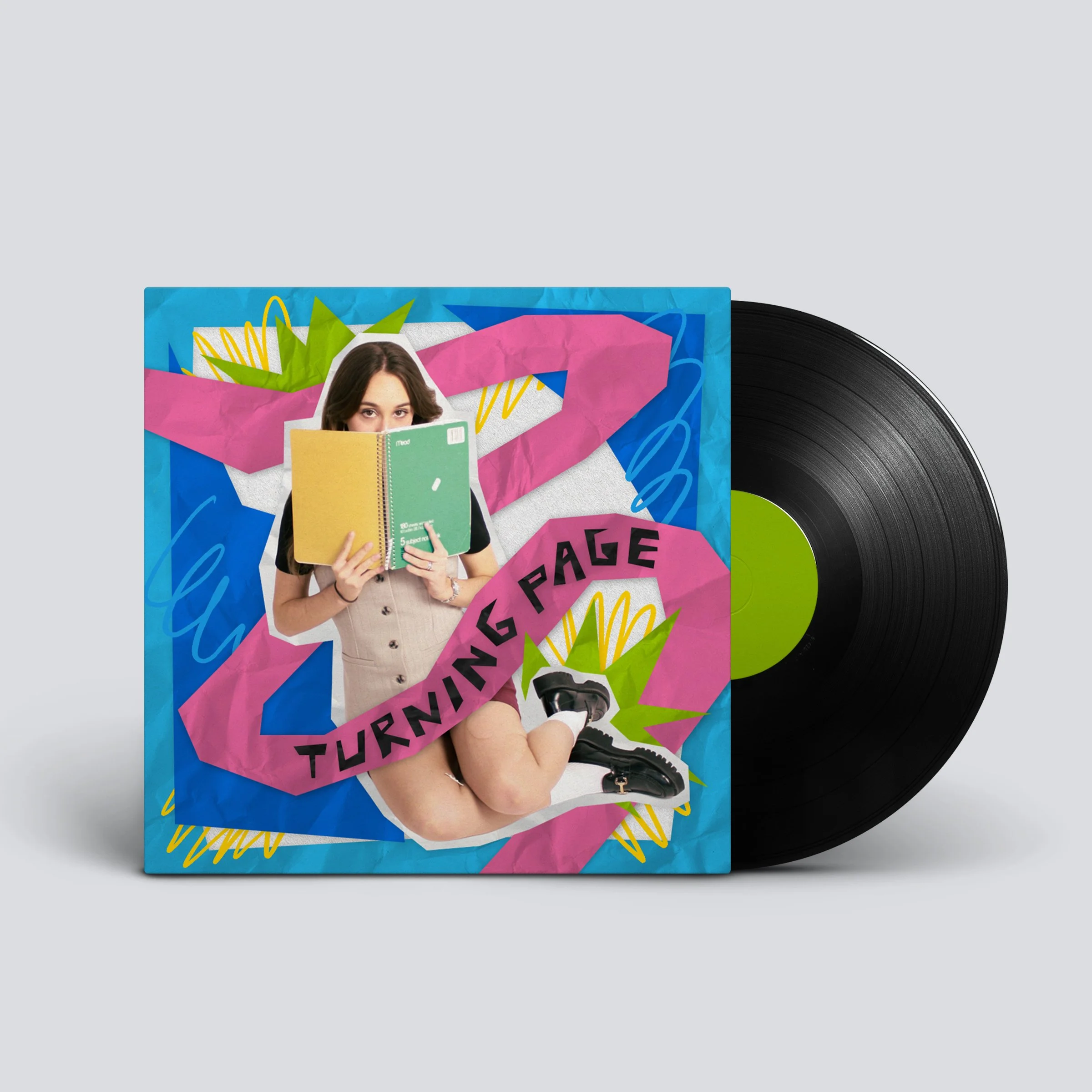
Dormiglioni Album Cover
-
PROJECT TYPE: Commissioned Project
DATES: December 2025
TOOLS: Procreate, Adobe Photoshop
-
Dormiglioni is a music duo from South Florida. Their upcoming EP, Turning Page, explores both the chaos and optimism of navigating your early 20s. I was commissioned to design the cover artwork, translating these themes of transition and growth.


CONCEPT DEVELOPMENT
I began with an initial consultation with the artists, where they shared a set of colorful, abstract visual references centered on themes of wandering and transition. Using these as a starting point, I developed five rough compositions and presented them in a pitch deck for discussion. We ultimately landed on a scrapbook-inspired direction to emphasize the nostalgia, playfulness, and exploration of the artists’ early 20s. The final design uses a beach-inspired color palette and abstract, palm tree–like shapes, drawing from the vivid imagery in the track Love Who You Are.

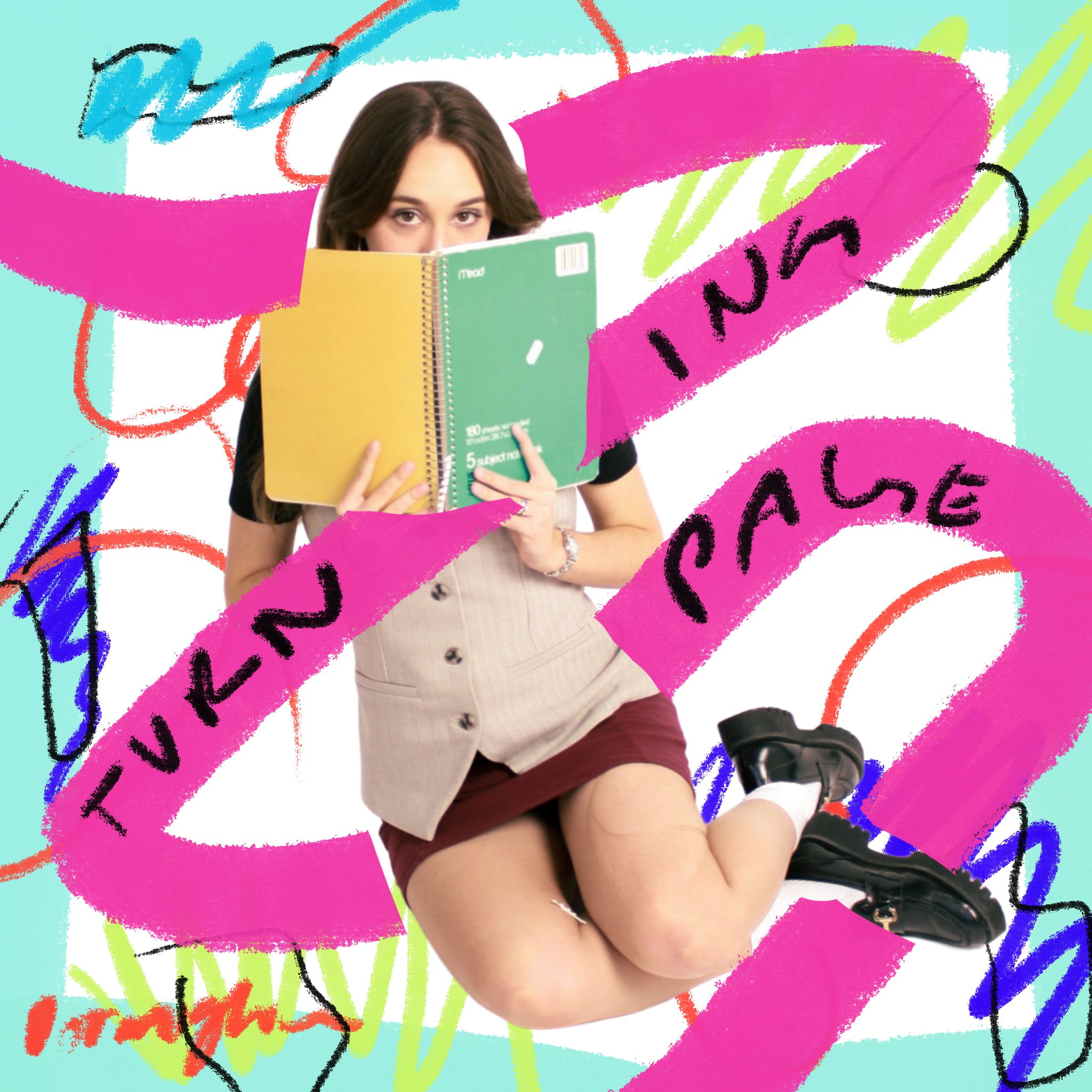
One of the first concepts I pitched used a found doodle of a cloud to loosely explore a “head in the clouds” theme, inspired by lyrics about wandering and existentialism. The focus was on playing with composition and ideas, keeping the design rough and exploratory.

I then explored a more surreal direction by combining photography and illustration, using found images purely as conceptual experiments. This created more layers and led me to the scrapbook approach. I also explored how craft scissors and other scrapbook elements could emphasize the concept of crafting as part of the design itself.
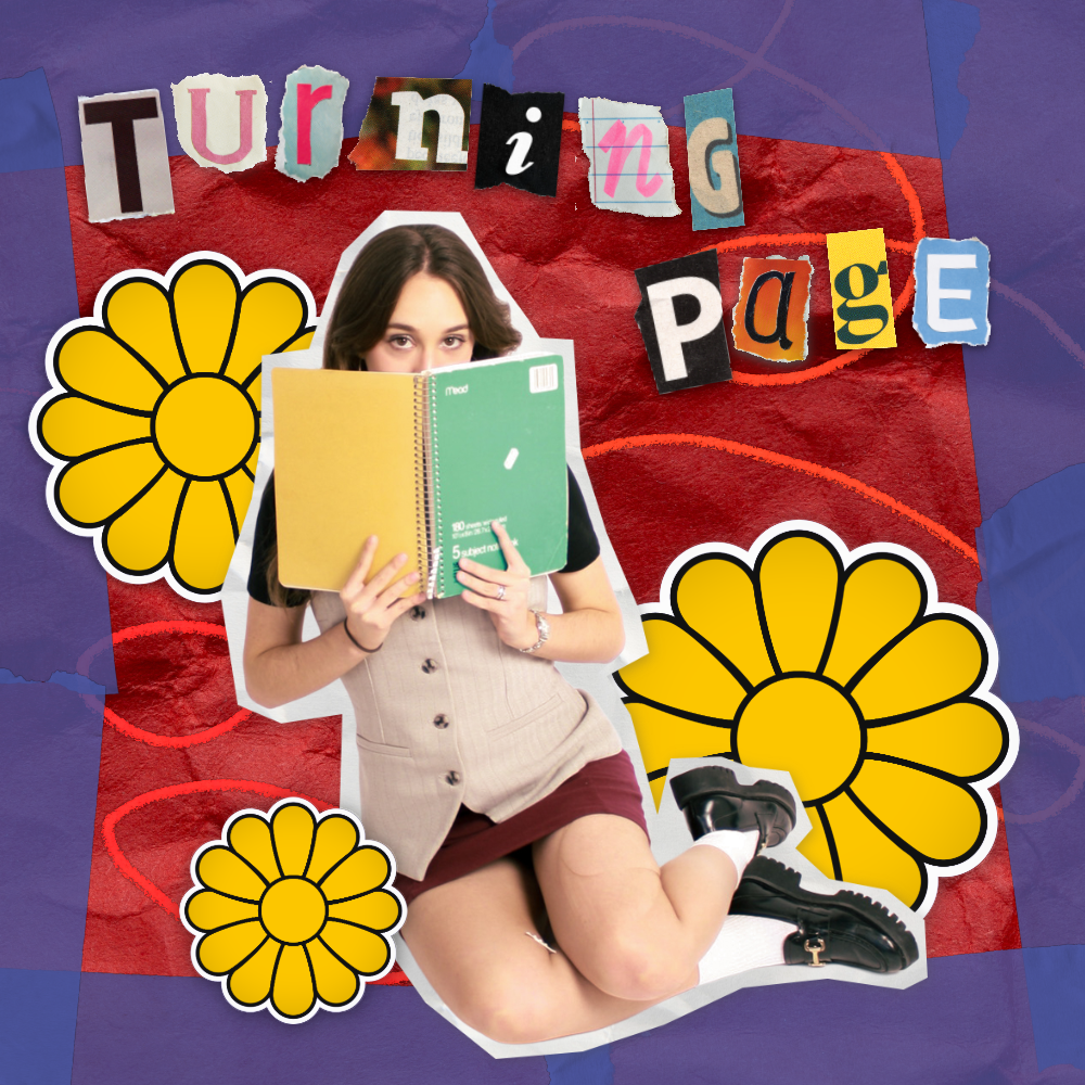
After sending the pitch deck, the artists responded most positively to the scrapbook concept and suggested more papery elements. I developed another concept incorporating stickers and crumpled paper, experimenting with a Y2K aesthetic. However, at this stage, the concept began to feel a bit too literal and on-the-nose.
I then explored paper cutouts, beginning with sketches of colorful, abstract shapes rather than literal imagery. The pink shape represents a path, symbolizing wandering and serving as the central focus. I “cut out” the shapes digitally in Photoshop, and after listening to the EP one more time, I finalized the beach-inspired color palette and incorporated abstract, palm tree–like shapes to connect the visuals to the music.