GKIDS FILMS
PROJECT TYPE: Marketing & advertising design, Typographical design
DATES: June 2025 – April 2026
GKIDS is the producer and distributor of award-winning animated films. As a graphic design intern, I designed a wide range of digital and print assets, including social media posts, promotional banners, newsletters, and awards materials.

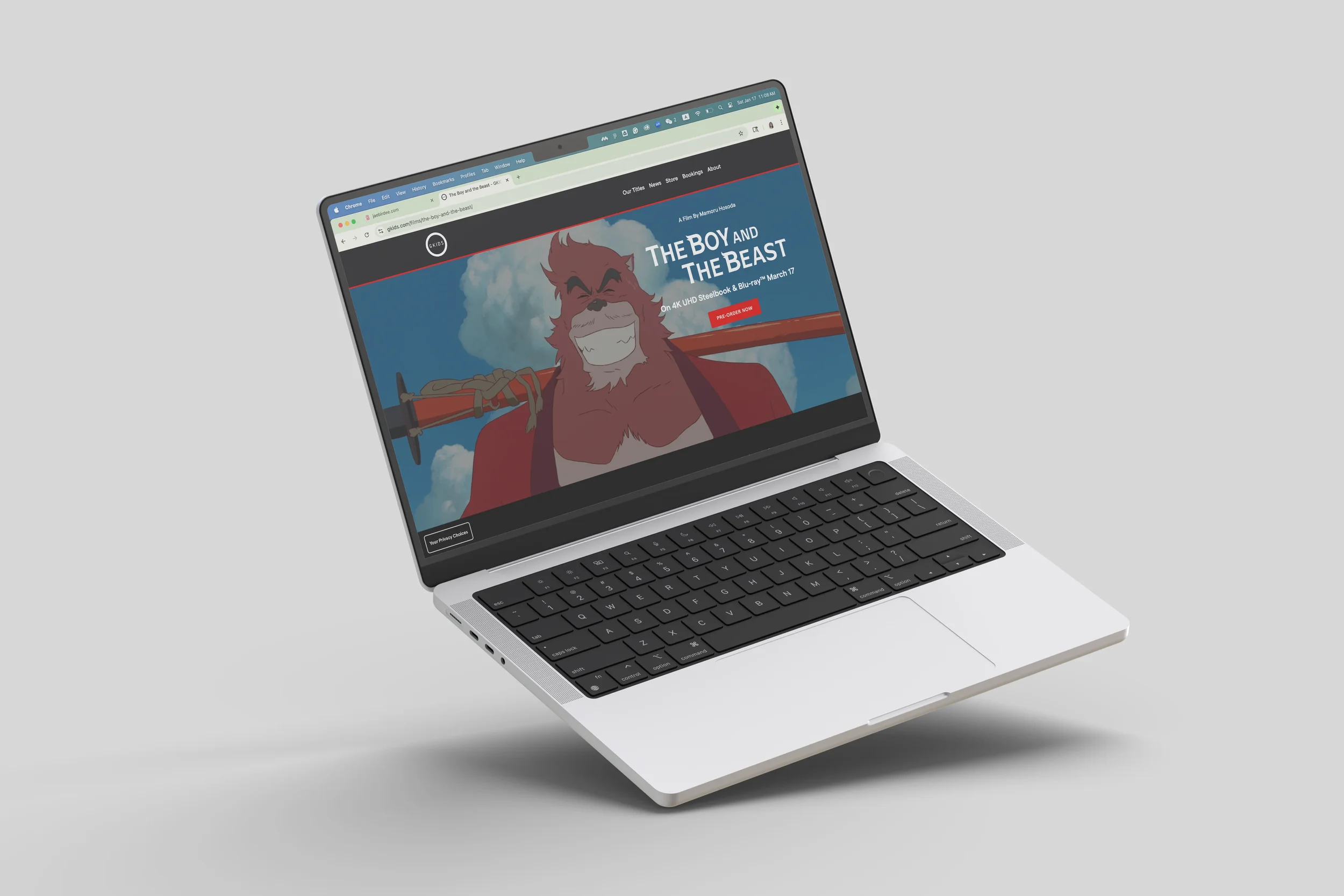
THE BOY AND THE BEAST
Working closely with the Art Director and Design Manager, I designed a new title treatment for the adventure-fantasy film The Boy and the Beast. I studied key scenes and character moments, explored typography and layout variations, and refined the design through multiple rounds of team feedback.
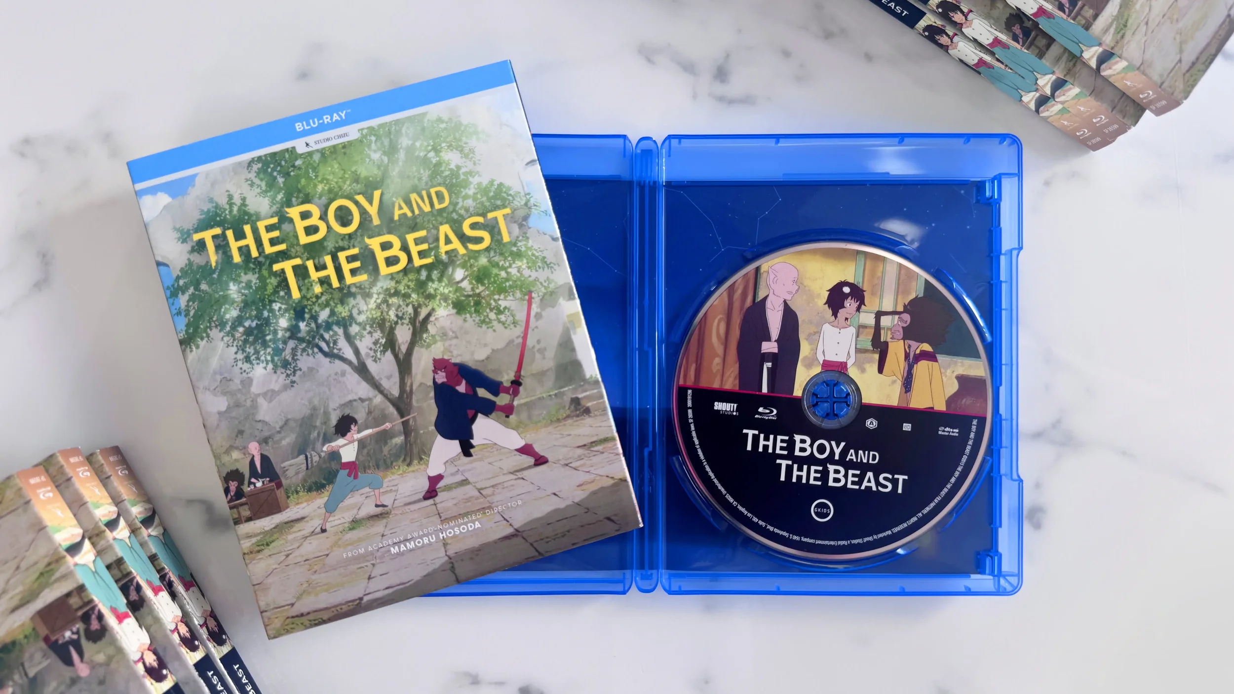

The tuft on the “B” in Boy reflects Ren’s hair, while its counterpart in Beast references Kumatetsu’s signature fur swirl, visually expressing their connection and found-family relationship.

GKIDS
NEWSLETTER
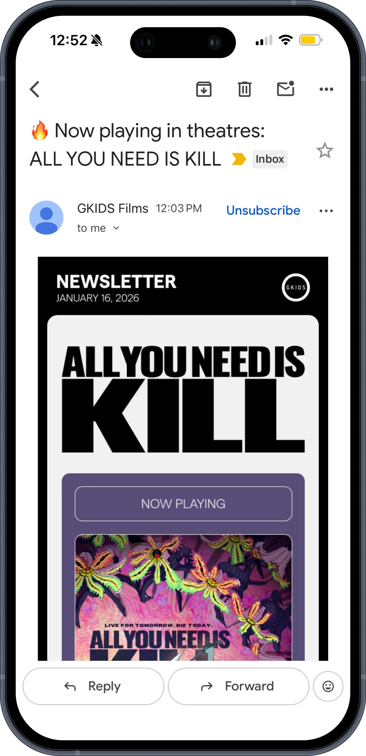
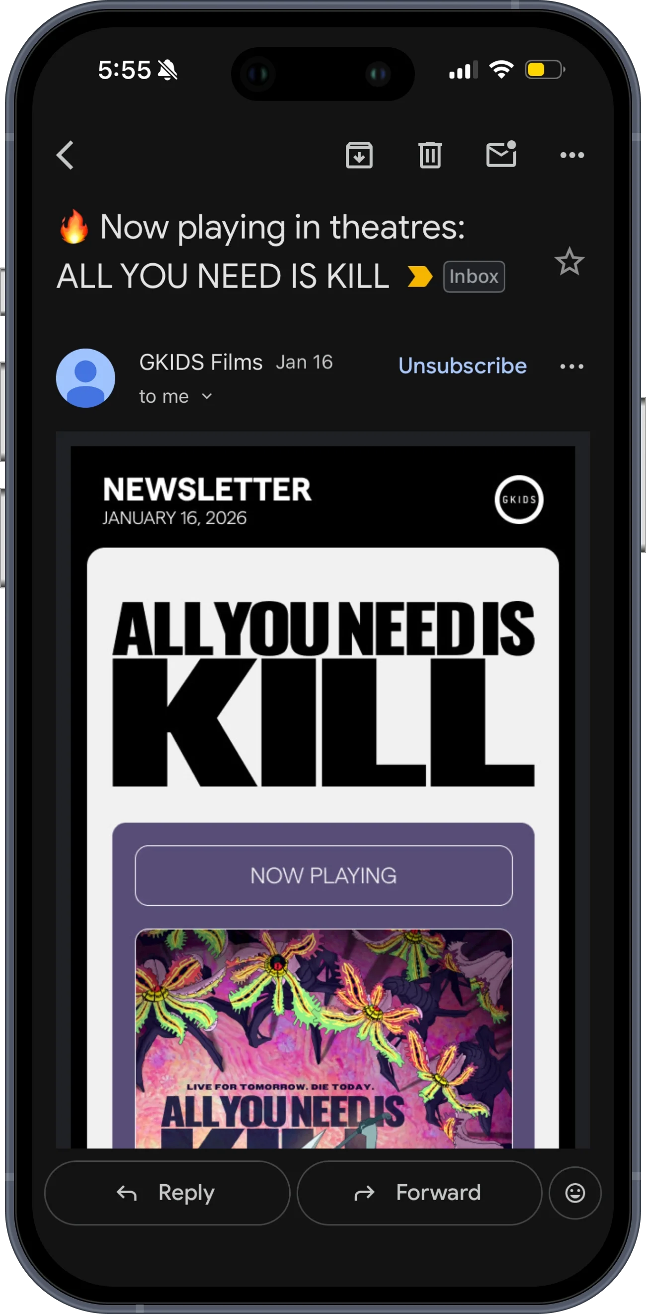
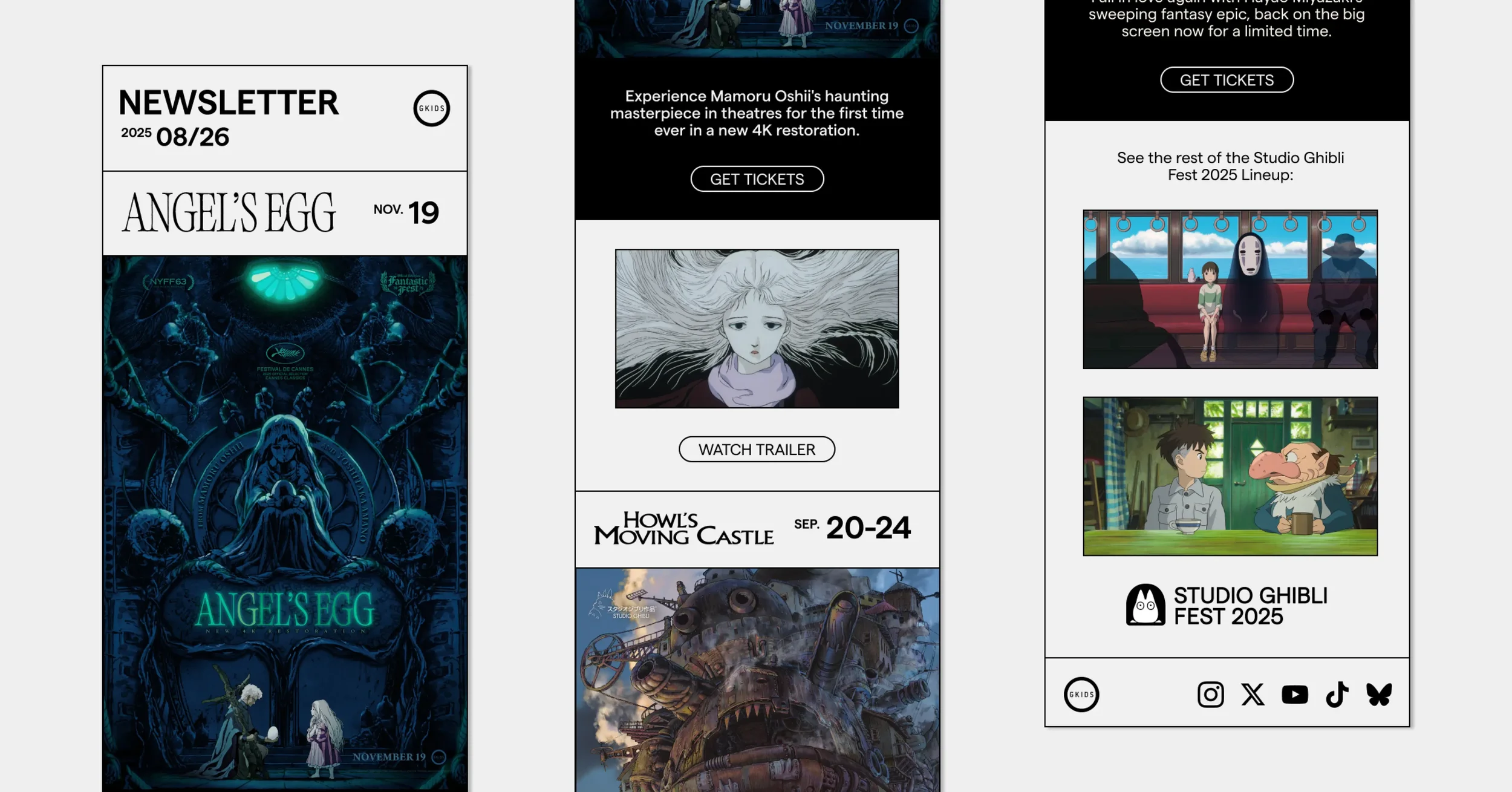
I led a comprehensive redesign of GKIDS’ newsletter, taking the project from design research to final execution starting in January 2026. Through multiple rounds of feedback with the design and marketing managers, I developed a flexible layout capable of accommodating home video releases, theatrical releases, events, awards, and other announcements.
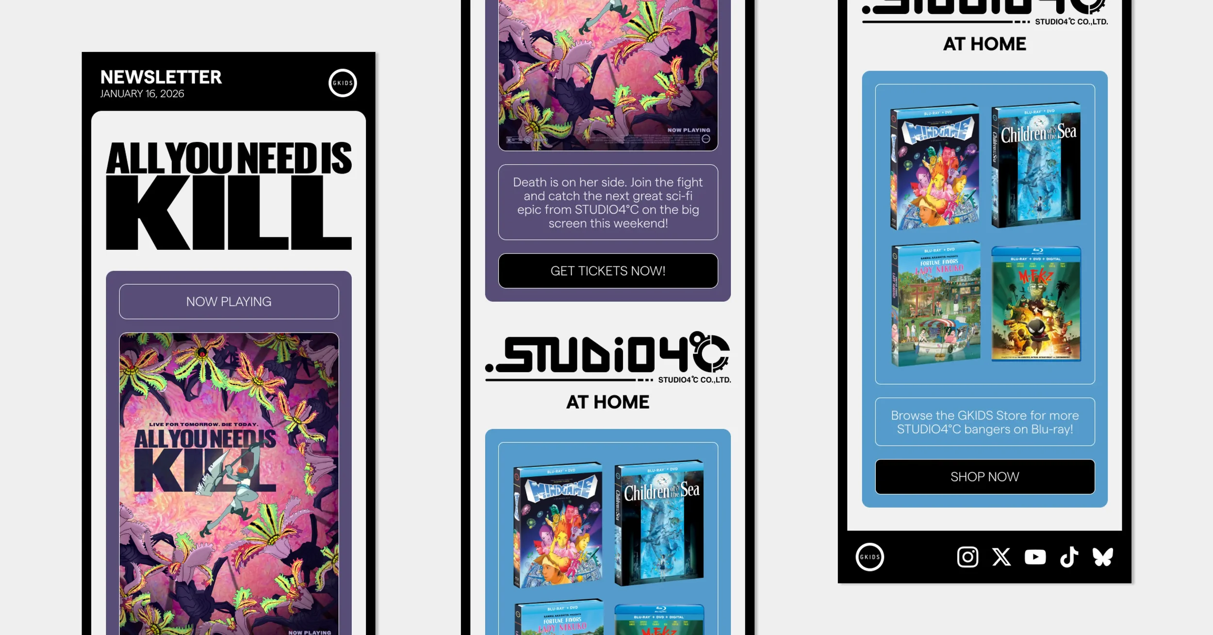
First official e-blast with my new design, January 16, 2026
concept development
After researching film industry newsletters, my first step was to create multiple layout options and gather feedback.
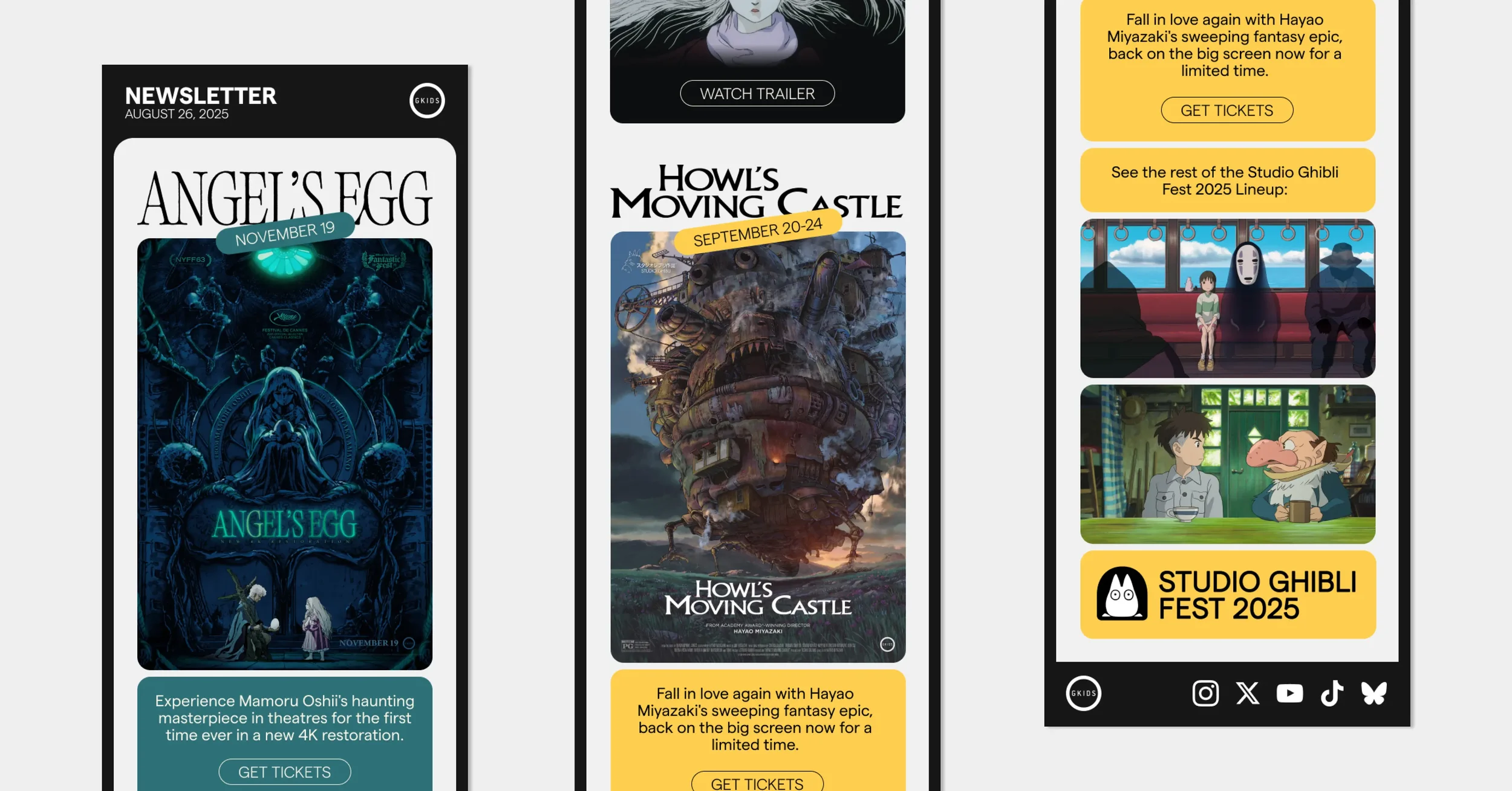
This early concept became the basis for the final direction. A challenge was how to display date labels and CTA buttons with clarity and flexibility.
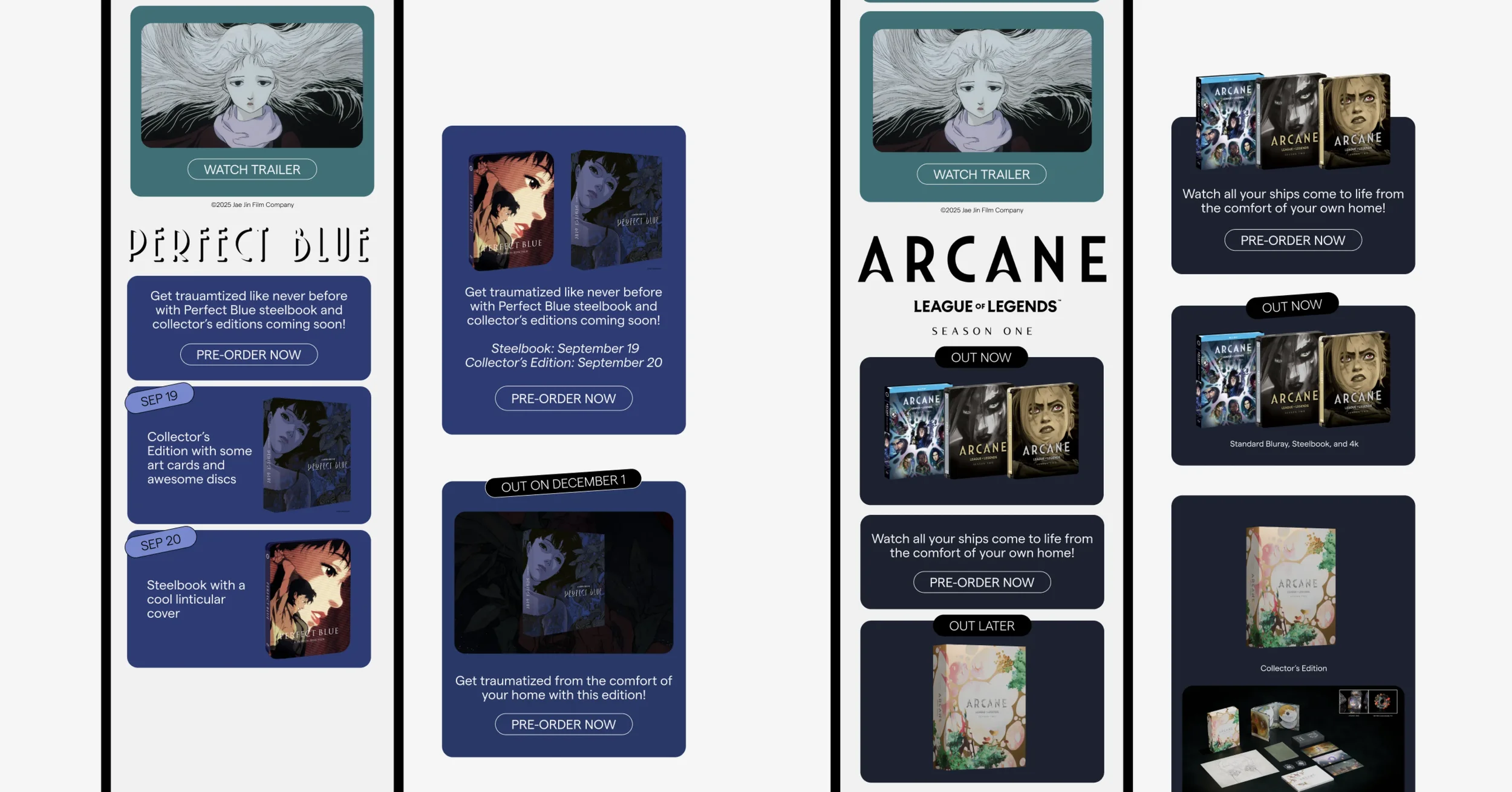
Another challenge was displaying product shots which came in all different render styles, and which could have multiple release dates across different SKUs.
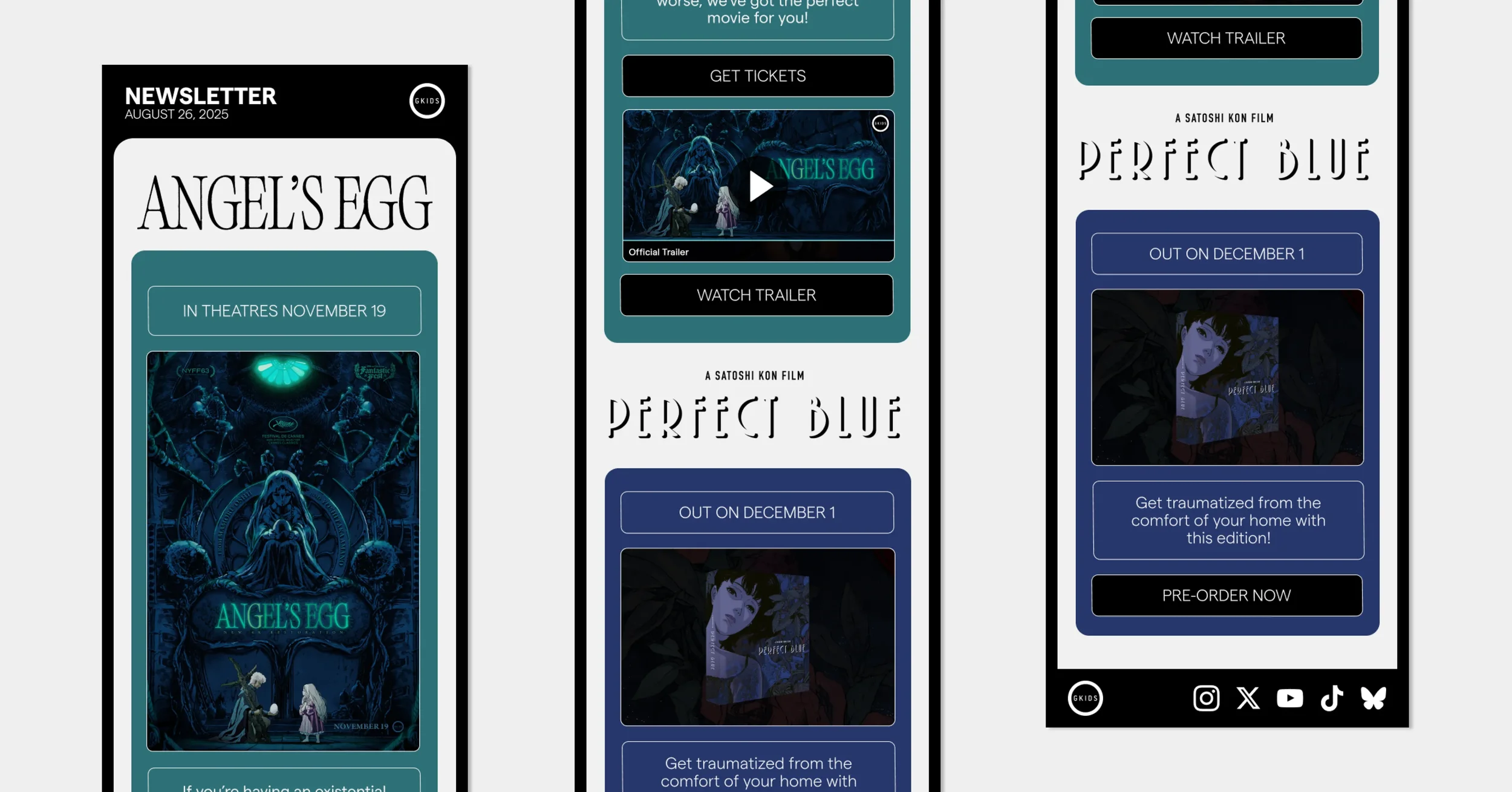
The final template: flexible, cohesive, and facilitates collaboration.

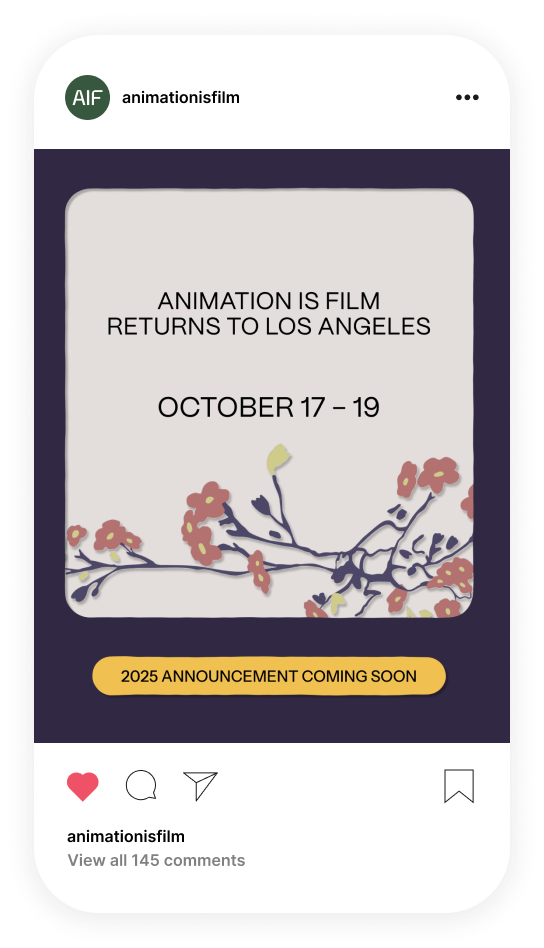
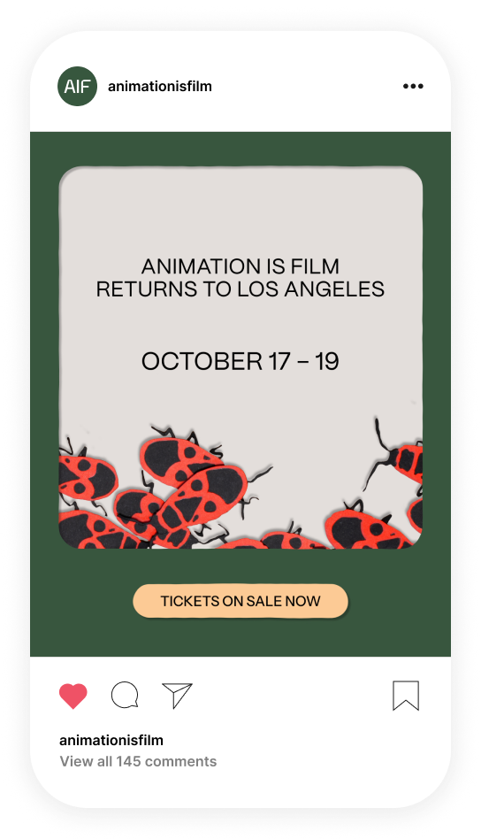
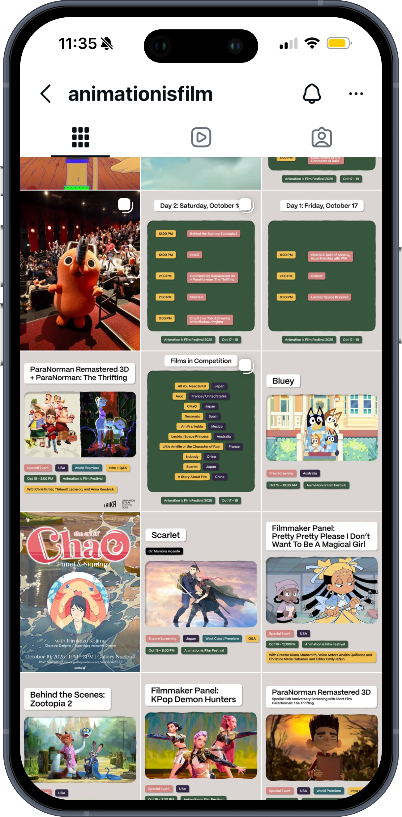
ANIMATION IS FILM
I made key creative contributions to marketing and festival materials for Animation Is Film, an annual festival in LA hosted by GKIDS, Annecy, and Variety Magazine that celebrates the best animation from around the world.
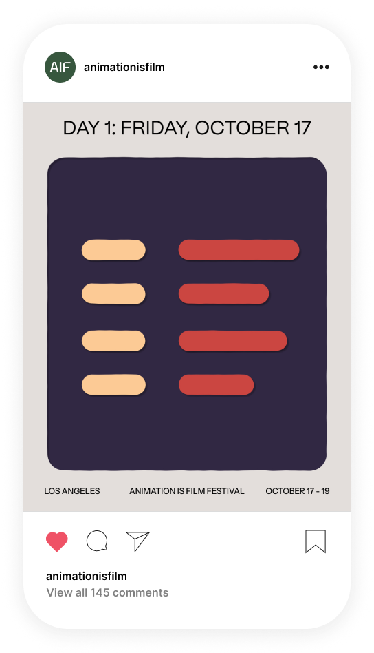
SOCIAL CONCEPTS
I used elements from the official poster artwork for Animation Is Film 2025 to brainstorm concepts for the social media posts.
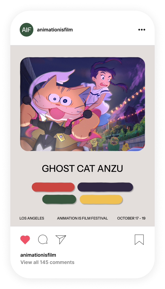
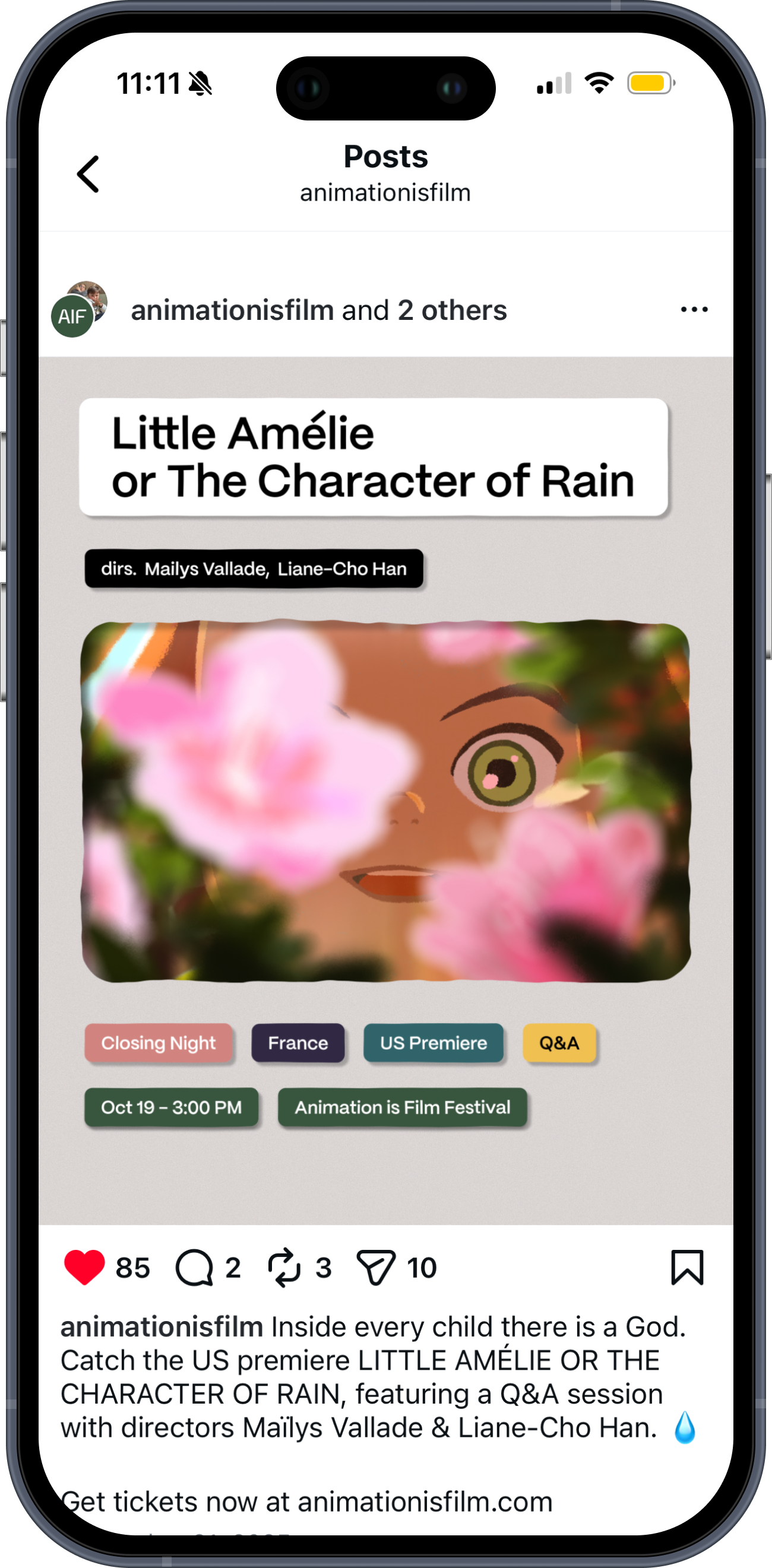
SOCIAL GRAPHICS
I helped the marketing team expand my concepts into the final social campaign.
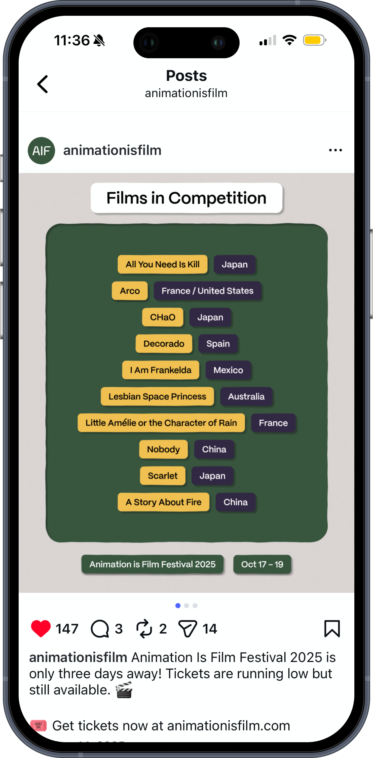
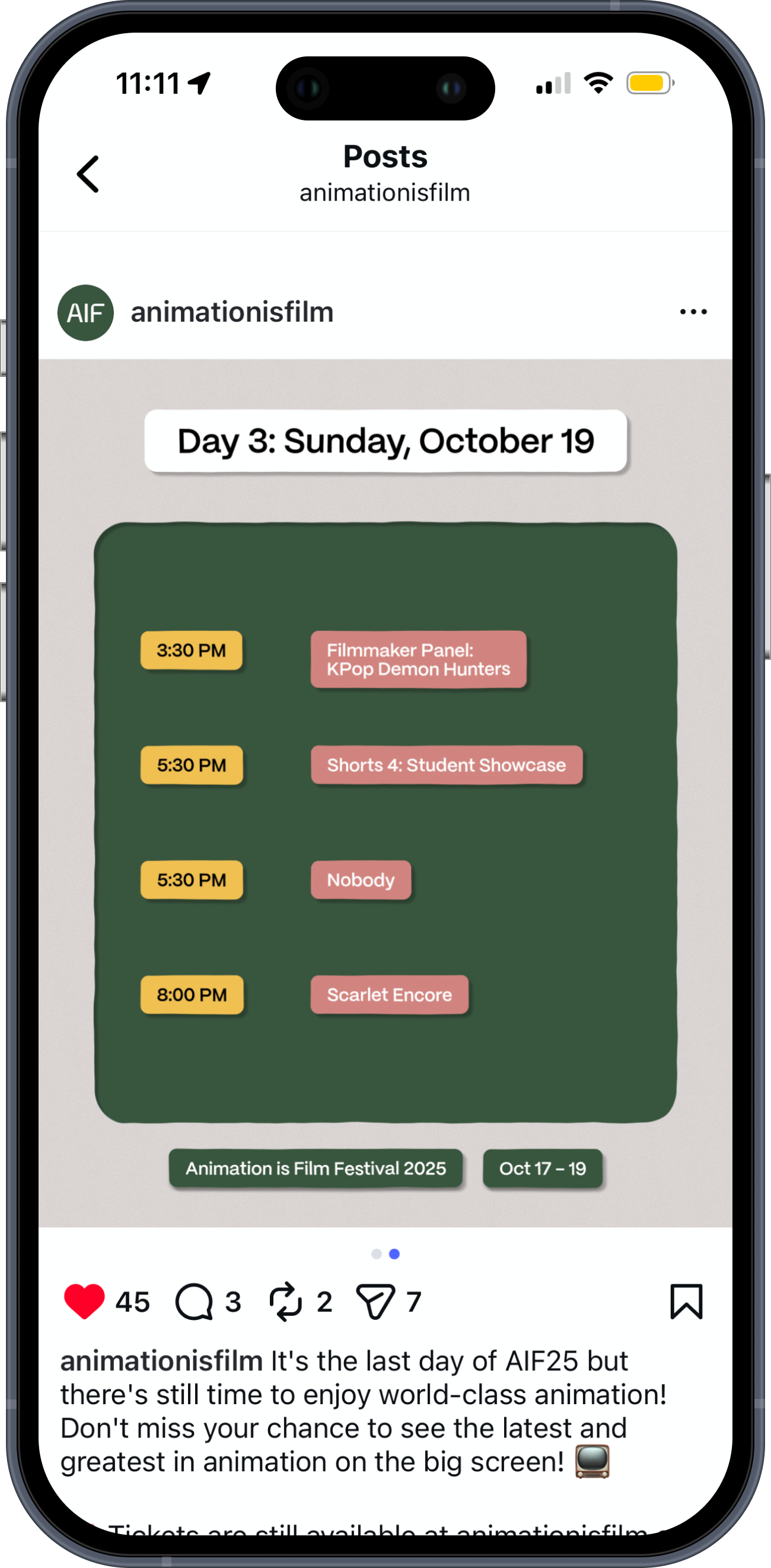
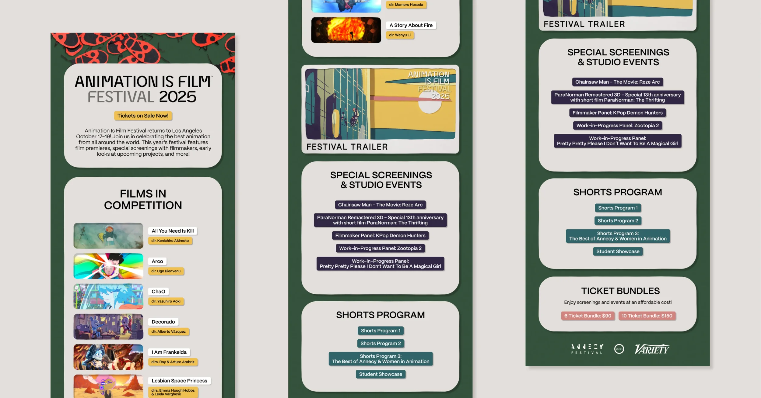
AIF NEWSLETTER
Using my social media graphics as a style reference, I designed the template for the AIF newsletter. The marketing team then filled out each issue with the appropriate content using this framework.

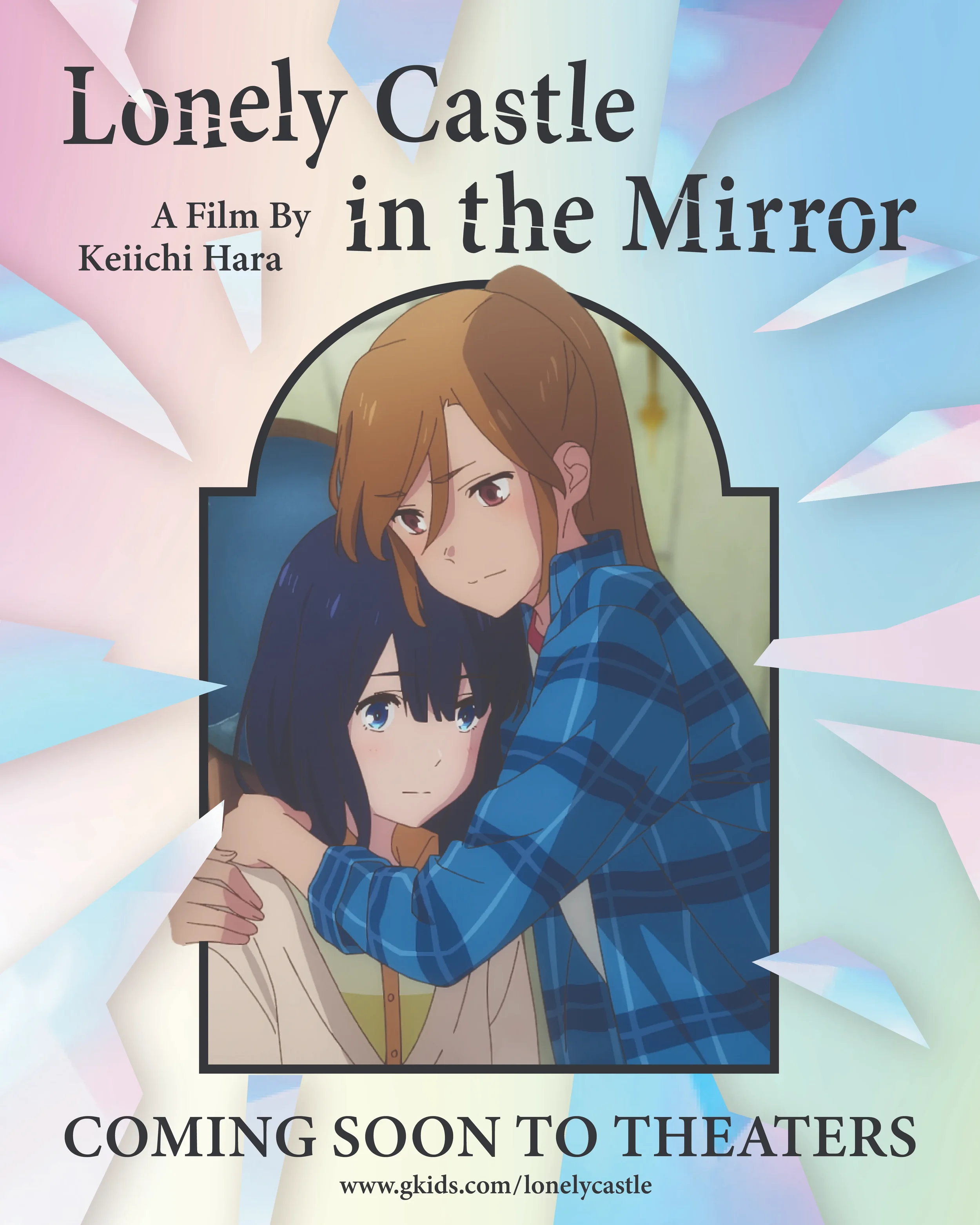
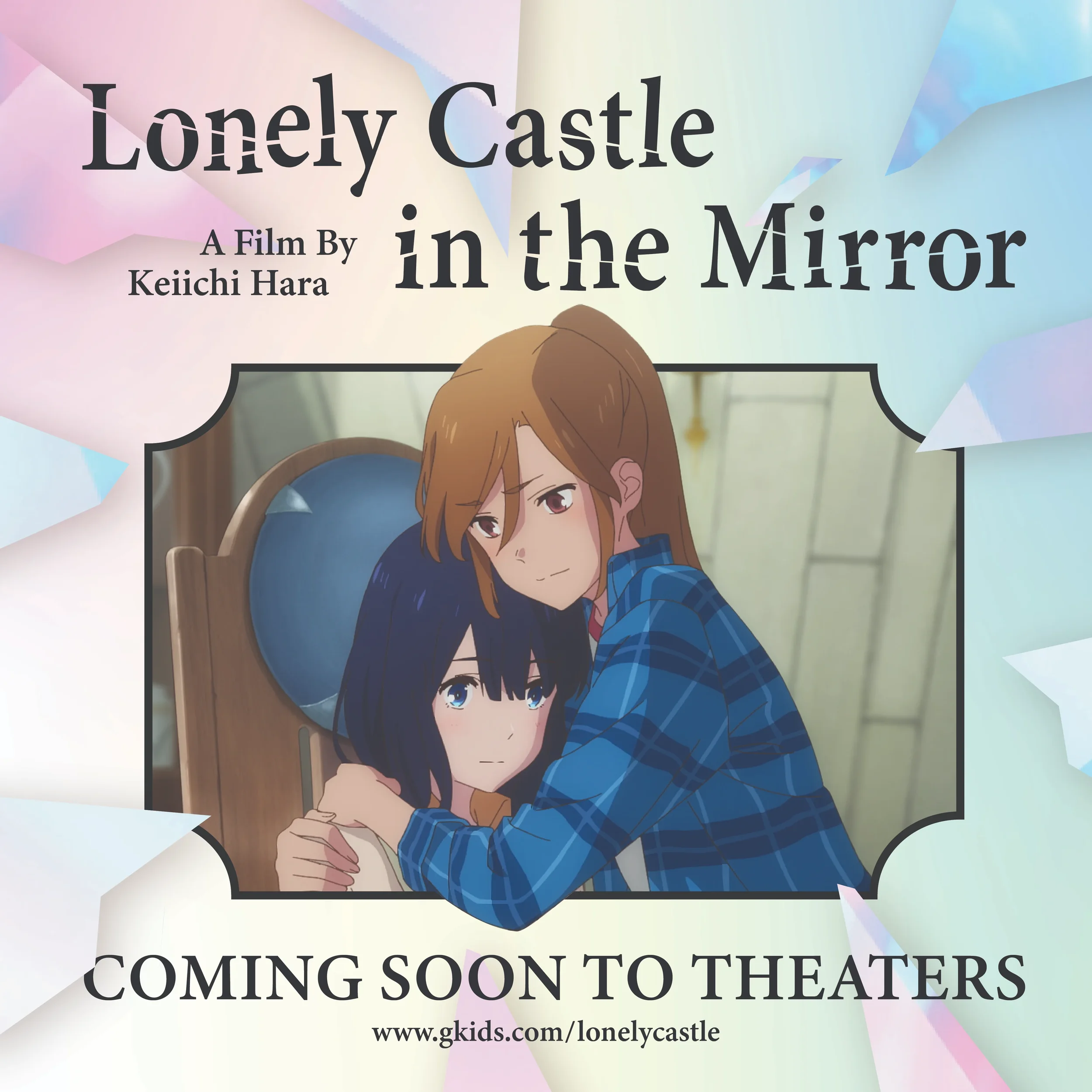
GKIDS EDIT TEST
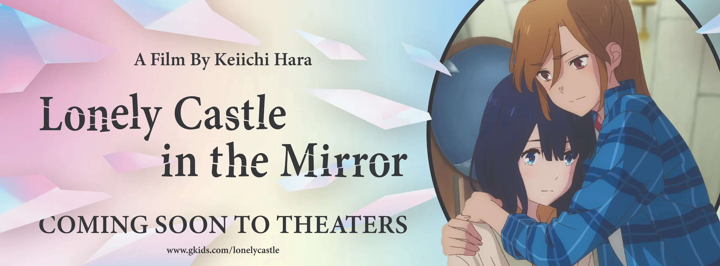
When I was applying to GKIDS, I was given an edit test where I was tasked to create a promotional graphic in three different aspect ratios. To make sure my concepts matched the spirit of Lonely Castle in the Mirror, I watched the film and took notes on its emotional arc and visual motifs.
SOCIAL MEDIA GRAPHICS
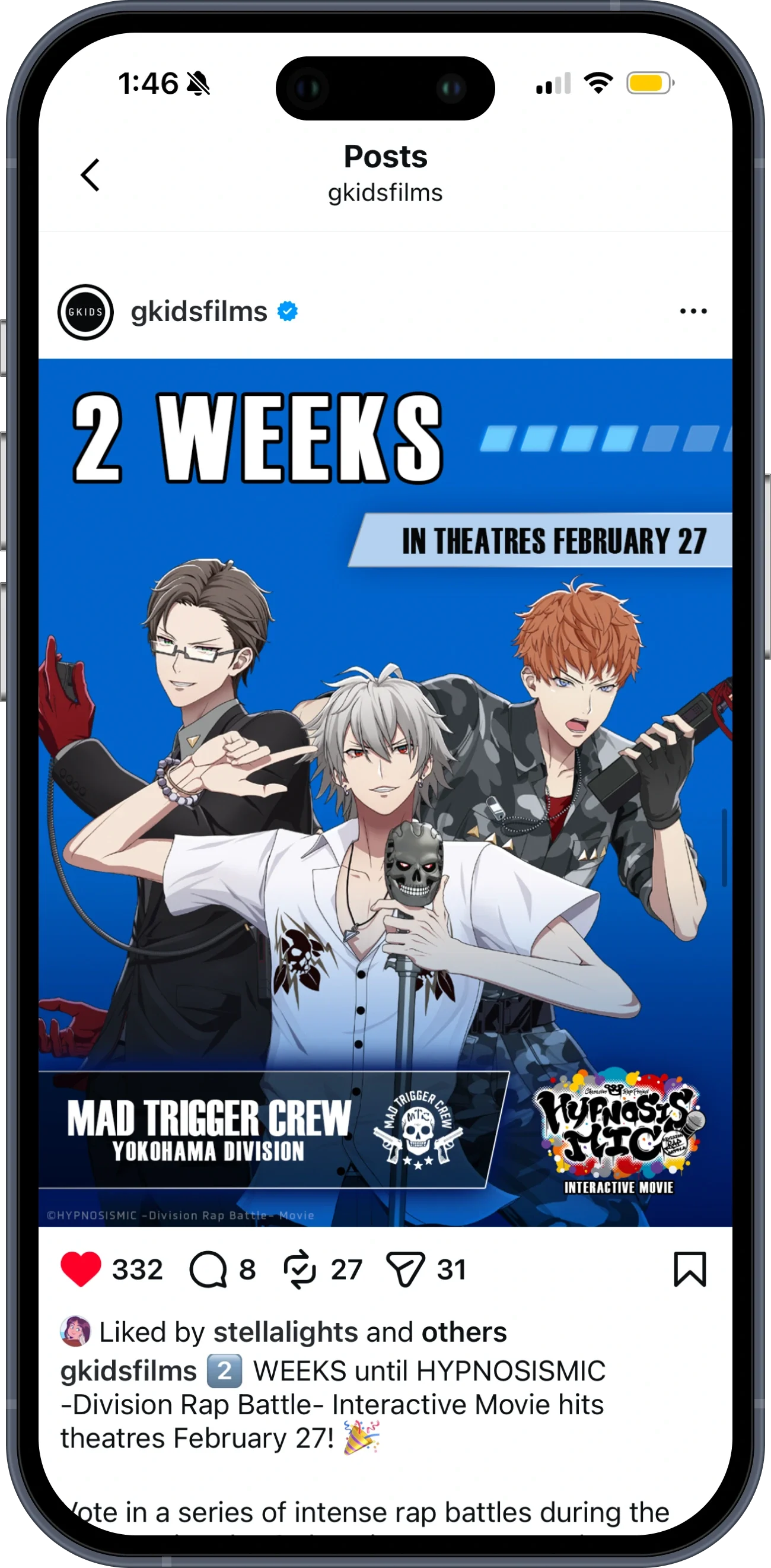
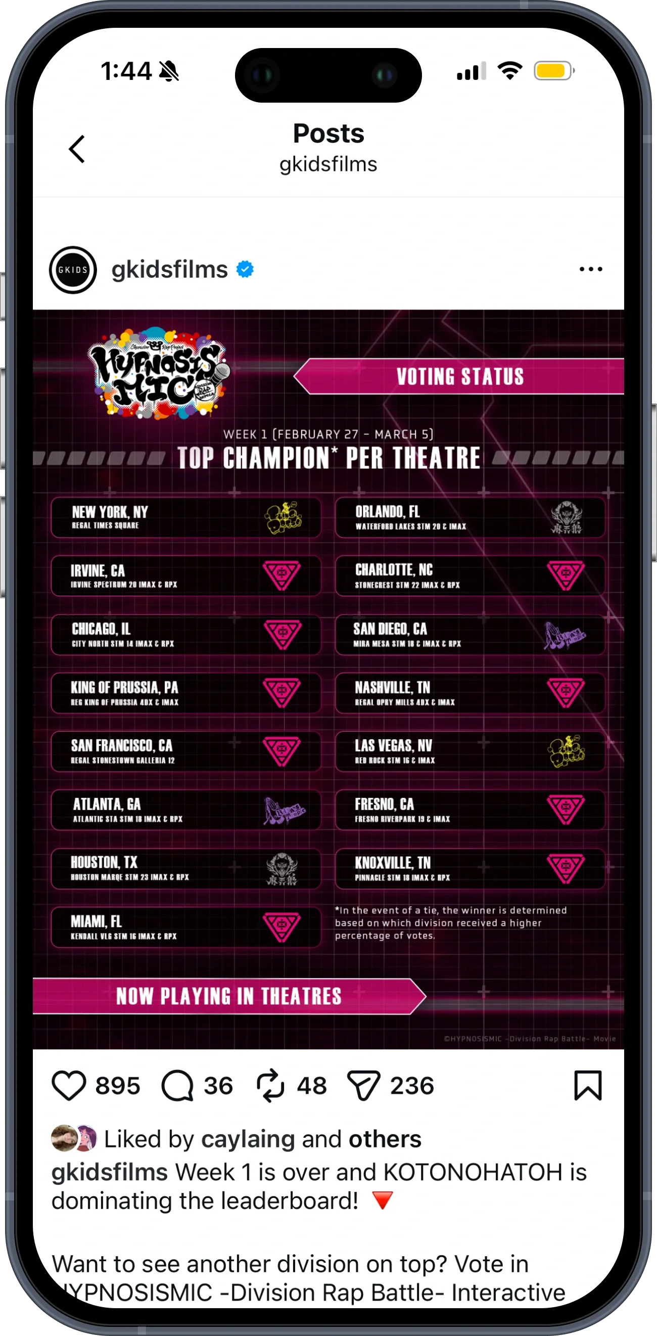
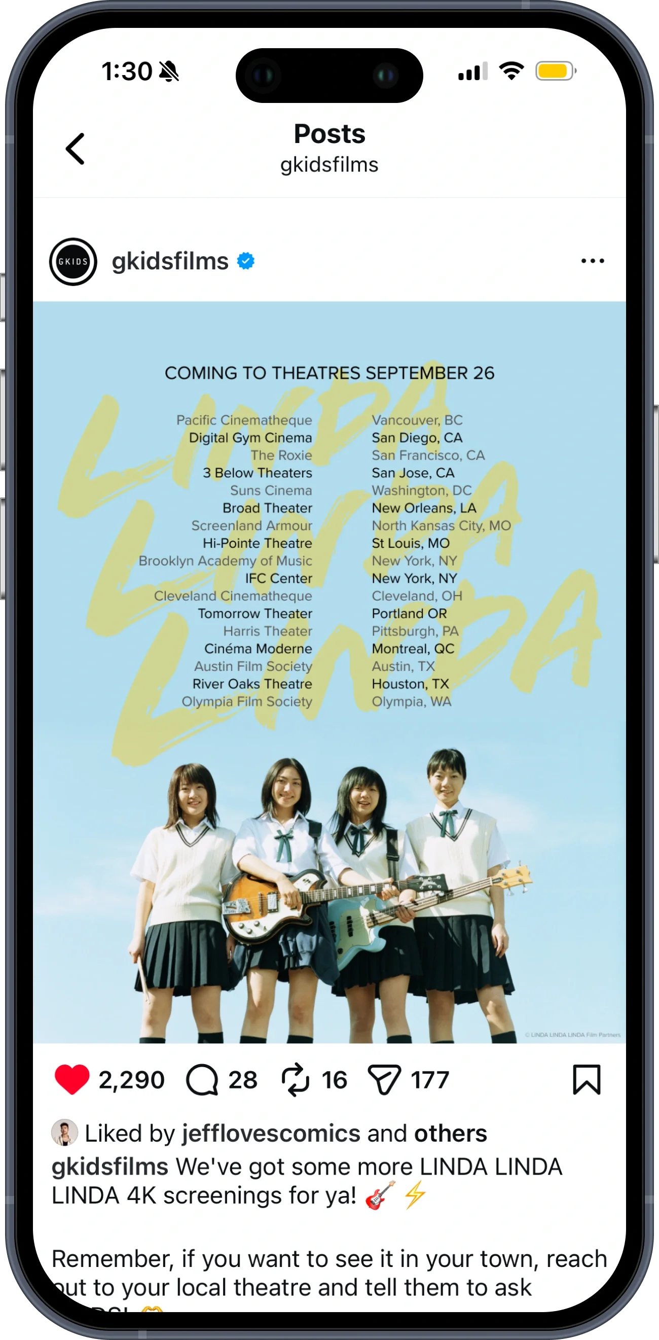
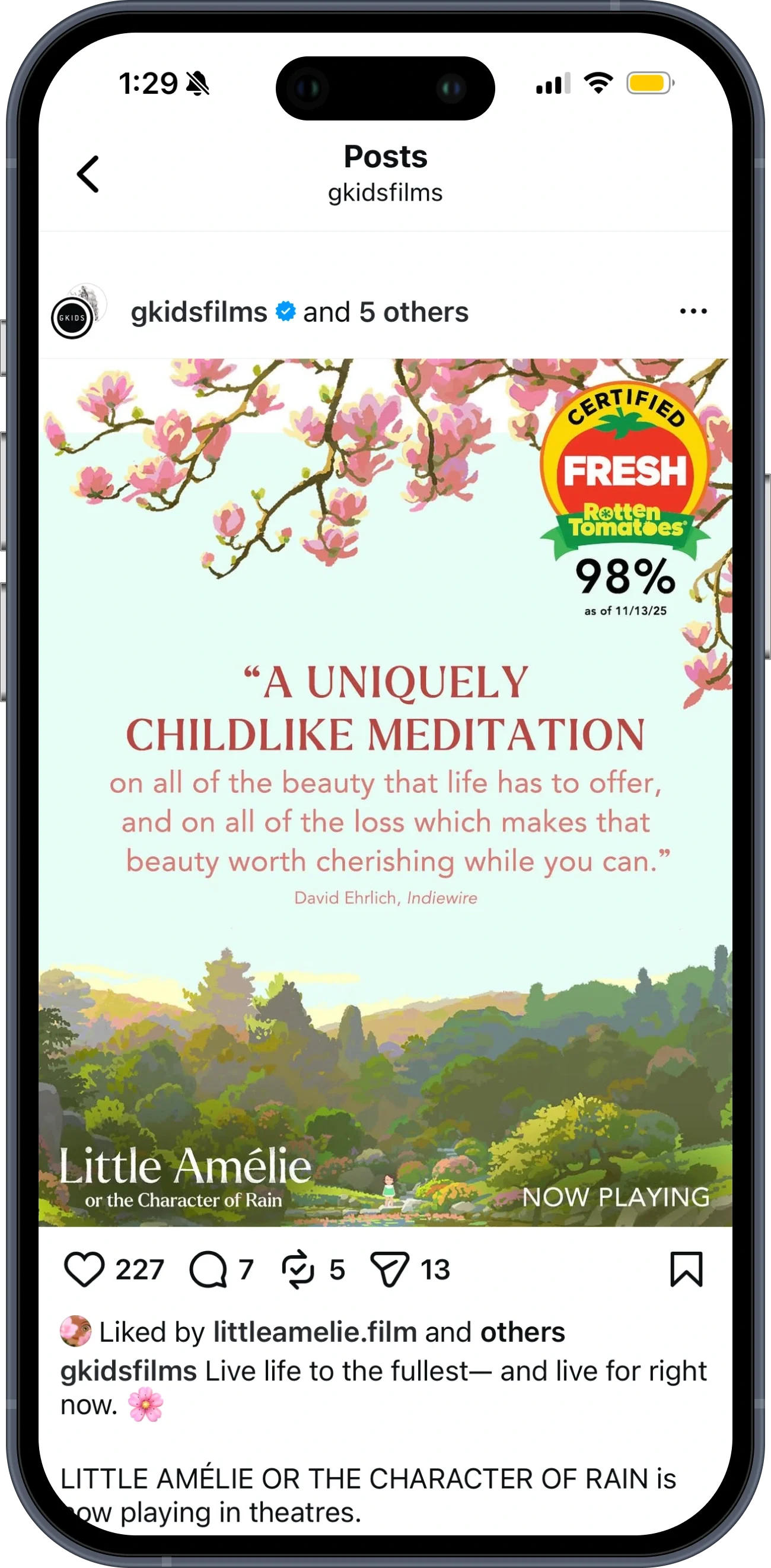
Part of my core responsibilities at GKIDS was to create social media graphics. I worked within each film's existing style guide, and for titles where one doesn't yet exist, I helped build out a visual identity for the social campaign.